| Package | spark.components.supportClasses |
| Class | public class GroupBase |
| Inheritance | GroupBase  UIComponent UIComponent  FlexSprite FlexSprite  Sprite Sprite  DisplayObjectContainer DisplayObjectContainer  InteractiveObject InteractiveObject  DisplayObject DisplayObject  EventDispatcher EventDispatcher  Object Object |
| Implements | IViewport |
| Subclasses | DataGroup, Group |
| Language Version: | ActionScript 3.0 |
| Product Version: | Flex 4 |
| Runtime Versions: | Flash Player 10, AIR 1.5 |
 Hide MXML Syntax
The <s:GroupBase> tag inherits all of the tag
attributes of its superclass and adds the following tag attributes:
  <s:GroupBase
    Properties
    autoLayout="true"
    clipAndEnableScrolling="false"
    horizontalScrollPosition="null"
    luminosityClip="false"
    luminosityInvert="false"
    layout="BasicLayout"
    mask=""
    maskType="clip"
    mouseEnabledWhereTransparent="true"
    resizeMode="noScale"
    verticalScrollPosition="no default"

    Styles
    accentColor="0x0099FF"
    alignmentBaseline="useDominantBaseline"
    alternatingItemColors="undefined"
    baselineShift="0"
    blockProgression="tb"
    breakOpportunity="auto"
    cffHinting="horizontalStem"
    chromeColor="0xCCCCCC"
    color="0x000000"
    contentBackgroundAlpha="1.0"
    contentBackgroundColor="0xFFFFFF"
    digitCase="default"
    digitWidth="default"
    direction="ltr"
    disabledAlpha="0.5"
    dominantBaseline="auto"
    firstBaselineOffset="auto"
    focusColor="0x70B2EE"
    focusedTextSelectionColor="A8C6EE"
    fontFamily="Arial"
    fontLookup="device"
    fontSize="12"
    fontStyle="normal"
    fontWeight="normal"
    inactiveTextSelectionColor="E8E8E8"
    justificationRule="auto"
    justificationStyle="auto"
    kerning="auto"
    leadingModel="auto"
    ligatureLevel="common"
    lineHeight="120%"
    lineThrough="false"
    locale="en"
    paragraphEndIndent="0"
    paragraphSpaceAfter="0"
    paragraphSpaceBefore="0"
    paragraphStartIndent="0"
    renderingMode="cff"
    rollOverColor="0xCEDBEF"
    symbolColor="0x000000"
    tabStops="null"
    textAlign="start"
    textAlignLast="start"
    textAlpha="1"
    textDecoration="none"
    textIndent="0"
    textJustify="interWord"
    textRotation="auto"
    trackingLeft="0"
    trackingRight="0"
    typographicCase="default"
    unfocusedTextSelectionColor="0xE8E8E8"
    whiteSpaceCollapse="collapse"
  />
See also
| Property | Defined By | ||
|---|---|---|---|
 | accessibilityDescription : String
A convenience accessor for the description property
in this UIComponent's accessibilityProperties object. | UIComponent | |
 | accessibilityEnabled : Boolean
A convenience accessor for the silent property
in this UIComponent's accessibilityProperties object. | UIComponent | |
 | accessibilityImplementation : AccessibilityImplementation
The current accessibility implementation (AccessibilityImplementation)
for this InteractiveObject instance. | InteractiveObject | |
 | accessibilityName : String
A convenience accessor for the name property
in this UIComponent's accessibilityProperties object. | UIComponent | |
 | accessibilityProperties : AccessibilityProperties
The current accessibility options for this display object. | DisplayObject | |
 | accessibilityShortcut : String
A convenience accessor for the shortcut property
in this UIComponent's accessibilityProperties object. | UIComponent | |
 | activeEffects : Array [read-only]
The list of effects that are currently playing on the component,
as an Array of EffectInstance instances. | UIComponent | |
 | alpha : Number
Indicates the alpha transparency value of the object specified. | DisplayObject | |
| autoLayout : Boolean
If true, measurement and layout are done
when the position or size of a child is changed. | GroupBase | ||
 | automationDelegate : Object
The delegate object that handles the automation-related functionality. | UIComponent | |
 | automationEnabled : Boolean [read-only]
True if this component is enabled for automation, false
otherwise. | UIComponent | |
 | automationName : String
Name that can be used as an identifier for this object. | UIComponent | |
 | automationOwner : DisplayObjectContainer [read-only]
The owner of this component for automation purposes. | UIComponent | |
 | automationParent : DisplayObjectContainer [read-only]
The parent of this component for automation purposes. | UIComponent | |
 | automationTabularData : Object [read-only]
An implementation of the IAutomationTabularData interface, which
can be used to retrieve the data. | UIComponent | |
 | automationValue : Array [read-only]
This value generally corresponds to the rendered appearance of the
object and should be usable for correlating the identifier with
the object as it appears visually within the application. | UIComponent | |
 | automationVisible : Boolean [read-only]
True if this component is visible for automation, false
otherwise. | UIComponent | |
 | baseline : Object
The vertical distance in pixels from the anchor target to
the control's baseline position. | UIComponent | |
| baselinePosition : Number [override] [read-only]
The y-coordinate of the baseline
of the first line of text of the component. | GroupBase | ||
 | blendMode : String
A value from the BlendMode class that specifies which blend mode to use. | DisplayObject | |
 | blendShader : Shader [write-only]
Sets a shader that is used for blending the foreground and background. | DisplayObject | |
 | bottom : Object
The vertical distance in pixels from the bottom edge of the component to the
anchor target's bottom edge. | UIComponent | |
 | buttonMode : Boolean
Specifies the button mode of this sprite. | Sprite | |
 | cacheAsBitmap : Boolean
If set to true, Flash runtimes cache an internal bitmap representation of the
display object. | DisplayObject | |
 |
If non-null, this Matrix object defines how a display object is rendered when
cacheAsBitmap is set to true. | DisplayObject | |
 | cacheHeuristic : Boolean [write-only]
Used by Flex to suggest bitmap caching for the object. | UIComponent | |
 | cachePolicy : String
Specifies the bitmap caching policy for this object. | UIComponent | |
 | className : String [read-only]
The name of this instance's class, such as "Button". | UIComponent | |
| clipAndEnableScrolling : Boolean
If true, specifies to clip the children to the boundaries of the viewport. | GroupBase | ||
 | constructor : Object
A reference to the class object or constructor function for a given object instance. | Object | |
| contentHeight : Number [read-only]
The height of the viewport's content. | GroupBase | ||
 | contentMouseX : Number [read-only]
Returns the x position of the mouse, in the content coordinate system. | UIComponent | |
 | contentMouseY : Number [read-only]
Returns the y position of the mouse, in the content coordinate system. | UIComponent | |
| contentWidth : Number [read-only]
The width of the viewport's contents. | GroupBase | ||
 | contextMenu : NativeMenu
Specifies the context menu associated with this object. | InteractiveObject | |
 | currentState : String
The current view state of the component. | UIComponent | |
 | cursorManager : ICursorManager [read-only]
Gets the CursorManager that controls the cursor for this component
and its peers. | UIComponent | |
 | depth : Number
Determines the order in which items inside of containers
are rendered. | UIComponent | |
 | descriptor : UIComponentDescriptor
Reference to the UIComponentDescriptor, if any, that was used
by the createComponentFromDescriptor() method to create this
UIComponent instance. | UIComponent | |
 | designLayer : DesignLayer
Specifies the optional DesignLayer instance associated with this visual
element. | UIComponent | |
 | document : Object
A reference to the document object associated with this UIComponent. | UIComponent | |
 | doubleClickEnabled : Boolean [override]
Specifies whether the UIComponent object receives doubleClick events. | UIComponent | |
 | dropTarget : DisplayObject [read-only]
Specifies the display object over which the sprite is being dragged, or on
which the sprite was dropped. | Sprite | |
 | enabled : Boolean
Whether the component can accept user interaction. | UIComponent | |
 | errorString : String
The text that displayed by a component's error tip when a
component is monitored by a Validator and validation fails. | UIComponent | |
 | explicitHeight : Number
Number that specifies the explicit height of the component,
in pixels, in the component's coordinates. | UIComponent | |
 | explicitMaxHeight : Number
The maximum recommended height of the component to be considered
by the parent during layout. | UIComponent | |
 | explicitMaxWidth : Number
The maximum recommended width of the component to be considered
by the parent during layout. | UIComponent | |
 | explicitMinHeight : Number
The minimum recommended height of the component to be considered
by the parent during layout. | UIComponent | |
 | explicitMinWidth : Number
The minimum recommended width of the component to be considered
by the parent during layout. | UIComponent | |
 | explicitWidth : Number
Number that specifies the explicit width of the component,
in pixels, in the component's coordinates. | UIComponent | |
 | filters : Array
An indexed array that contains each filter object currently associated with the display object. | DisplayObject | |
 | flexContextMenu : IFlexContextMenu
The context menu for this UIComponent. | UIComponent | |
 | focusEnabled : Boolean
Indicates whether the component can receive focus when tabbed to. | UIComponent | |
 | focusManager : IFocusManager
Gets the FocusManager that controls focus for this component
and its peers. | UIComponent | |
 | focusPane : Sprite
The focus pane associated with this object. | UIComponent | |
 | focusRect : Object
Specifies whether this object displays a focus rectangle. | InteractiveObject | |
 | graphics : Graphics [read-only]
Specifies the Graphics object that belongs to this sprite where vector
drawing commands can occur. | Sprite | |
 | hasFocusableChildren : Boolean
A flag that indicates whether child objects can receive focus. | UIComponent | |
 | hasLayoutMatrix3D : Boolean [read-only]
Contians true if the element has 3D Matrix. | UIComponent | |
 | height : Number [override]
Number that specifies the height of the component, in pixels,
in the parent's coordinates. | UIComponent | |
 | hitArea : Sprite
Designates another sprite to serve as the hit area for a sprite. | Sprite | |
 | horizontalCenter : Object
The horizontal distance in pixels from the center of the component to the
center of the anchor target's content area. | UIComponent | |
| horizontalScrollPosition : Number
The x coordinate of the origin of the viewport in the component's coordinate system,
where the default value is (0,0) corresponding to the upper-left corner of the component. | GroupBase | ||
 | id : String
ID of the component. | UIComponent | |
 | includeInLayout : Boolean
Specifies whether this component is included in the layout of the
parent container. | UIComponent | |
 | inheritingStyles : Object
The beginning of this component's chain of inheriting styles. | UIComponent | |
 | initialized : Boolean
A flag that determines if an object has been through all three phases
of layout: commitment, measurement, and layout (provided that any were required). | UIComponent | |
 | instanceIndex : int [read-only]
The index of a repeated component. | UIComponent | |
 | instanceIndices : Array
An Array containing the indices required to reference
this UIComponent object from its parent document. | UIComponent | |
 | is3D : Boolean [read-only]
Contains true when the element is in 3D. | UIComponent | |
 | isDocument : Boolean [read-only]
Contains true if this UIComponent instance is a document object. | UIComponent | |
 | isPopUp : Boolean
Set to true by the PopUpManager to indicate
that component has been popped up. | UIComponent | |
| layout : LayoutBase
The layout object for this container. | GroupBase | ||
 | layoutMatrix3D : Matrix3D [write-only]
The transform matrix that is used to calculate a component's layout
relative to its siblings. | UIComponent | |
 | left : Object
The horizontal distance in pixels from the left edge of the component to the
anchor target's left edge. | UIComponent | |
 | loaderInfo : LoaderInfo [read-only]
Returns a LoaderInfo object containing information about loading the file
to which this display object belongs. | DisplayObject | |
| luminosityClip : Boolean
A property that controls whether the luminosity
mask clips the masked content. | GroupBase | ||
| luminosityInvert : Boolean
A property that controls the calculation of the RGB
color value of a graphic element being masked by
a luminosity mask. | GroupBase | ||
 | maintainProjectionCenter : Boolean
When true, the component keeps its projection matrix centered on the
middle of its bounding box. | UIComponent | |
| mask : DisplayObject [override]
Sets the mask. | GroupBase | ||
| maskType : String
The mask type. | GroupBase | ||
 | maxHeight : Number
The maximum recommended height of the component to be considered
by the parent during layout. | UIComponent | |
 | maxWidth : Number
The maximum recommended width of the component to be considered
by the parent during layout. | UIComponent | |
 | measuredHeight : Number
The default height of the component, in pixels. | UIComponent | |
 | measuredMinHeight : Number
The default minimum height of the component, in pixels. | UIComponent | |
 | measuredMinWidth : Number
The default minimum width of the component, in pixels. | UIComponent | |
 | measuredWidth : Number
The default width of the component, in pixels. | UIComponent | |
 | minHeight : Number
The minimum recommended height of the component to be considered
by the parent during layout. | UIComponent | |
 | minWidth : Number
The minimum recommended width of the component to be considered
by the parent during layout. | UIComponent | |
 | moduleFactory : IFlexModuleFactory
A module factory is used as context for using embedded fonts and for
finding the style manager that controls the styles for this
component. | UIComponent | |
 | mouseChildren : Boolean
Determines whether or not the children of the object are mouse, or user input device, enabled. | DisplayObjectContainer | |
 | mouseEnabled : Boolean
Specifies whether this object receives mouse, or other user input, messages. | InteractiveObject | |
| mouseEnabledWhereTransparent : Boolean
When true, this property
ensures that the entire bounds of the Group respond to
mouse events such as click and roll over. | GroupBase | ||
 | mouseFocusEnabled : Boolean
Whether you can receive focus when clicked on. | UIComponent | |
 | mouseX : Number [read-only]
Indicates the x coordinate of the mouse or user input device position, in pixels. | DisplayObject | |
 | mouseY : Number [read-only]
Indicates the y coordinate of the mouse or user input device position, in pixels. | DisplayObject | |
 | name : String
Indicates the instance name of the DisplayObject. | DisplayObject | |
 | nestLevel : int
Depth of this object in the containment hierarchy. | UIComponent | |
 | nonInheritingStyles : Object
The beginning of this component's chain of non-inheriting styles. | UIComponent | |
 | numAutomationChildren : int [read-only]
The number of automation children this container has. | UIComponent | |
 | numChildren : int [read-only]
Returns the number of children of this object. | DisplayObjectContainer | |
| numElements : int [read-only]
The number of visual elements in this container. | GroupBase | ||
 | opaqueBackground : Object
Specifies whether the display object is opaque with a certain background color. | DisplayObject | |
| overlay : DisplayLayer [read-only]
The overlay plane for this group. | GroupBase | ||
 | owner : DisplayObjectContainer
The owner of this IVisualElement object. | UIComponent | |
 | parent : DisplayObjectContainer [override] [read-only]
The parent container or component for this component. | UIComponent | |
 | parentApplication : Object [read-only]
A reference to the Application object that contains this UIComponent
instance. | UIComponent | |
 | parentDocument : Object [read-only]
A reference to the parent document object for this UIComponent. | UIComponent | |
 | percentHeight : Number
Specifies the height of a component as a percentage
of its parent's size. | UIComponent | |
 | percentWidth : Number
Specifies the width of a component as a percentage
of its parent's size. | UIComponent | |
 | postLayoutTransformOffsets : mx.geom:TransformOffsets
Defines a set of adjustments that can be applied to the object's
transform in a way that is invisible to its parent's layout. | UIComponent | |
 | processedDescriptors : Boolean
Set to true after immediate or deferred child creation,
depending on which one happens. | UIComponent | |
 | prototype : Object [static]
A reference to the prototype object of a class or function object. | Object | |
 | repeater : IRepeater [read-only]
A reference to the Repeater object
in the parent document that produced this UIComponent. | UIComponent | |
 | repeaterIndex : int [read-only]
The index of the item in the data provider
of the Repeater that produced this UIComponent. | UIComponent | |
 | repeaterIndices : Array
An Array containing the indices of the items in the data provider
of the Repeaters in the parent document that produced this UIComponent. | UIComponent | |
 | repeaters : Array
An Array containing references to the Repeater objects
in the parent document that produced this UIComponent. | UIComponent | |
| resizeMode : String
The ResizeMode for this container. | GroupBase | ||
 | right : Object
The horizontal distance in pixels from the right edge of the component to the
anchor target's right edge. | UIComponent | |
 | root : DisplayObject [read-only]
For a display object in a loaded SWF file, the root property is the
top-most display object in the portion of the display list's tree structure represented by that SWF file. | DisplayObject | |
 | rotation : Number [override]
Indicates the rotation of the DisplayObject instance, in degrees, from its original orientation. | UIComponent | |
 | rotationX : Number [override]
Indicates the x-axis rotation of the DisplayObject instance, in degrees, from its original orientation
relative to the 3D parent container. | UIComponent | |
 | rotationY : Number [override]
Indicates the y-axis rotation of the DisplayObject instance, in degrees, from its original orientation
relative to the 3D parent container. | UIComponent | |
 | rotationZ : Number [override]
Indicates the z-axis rotation of the DisplayObject instance, in degrees, from its original orientation relative to the 3D parent container. | UIComponent | |
 | scale9Grid : Rectangle
The current scaling grid that is in effect. | DisplayObject | |
 | scaleX : Number [override]
Number that specifies the horizontal scaling factor. | UIComponent | |
 | scaleY : Number [override]
Number that specifies the vertical scaling factor. | UIComponent | |
 | scaleZ : Number [override]
Number that specifies the scaling factor along the z axis. | UIComponent | |
 | screen : Rectangle [read-only]
Returns an object that contains the size and position of the base
drawing surface for this object. | UIComponent | |
 | scrollRect : Rectangle
The scroll rectangle bounds of the display object. | DisplayObject | |
 | showInAutomationHierarchy : Boolean
A flag that determines if an automation object
shows in the automation hierarchy. | UIComponent | |
 | soundTransform : flash.media:SoundTransform
Controls sound within this sprite. | Sprite | |
 | stage : Stage [read-only]
The Stage of the display object. | DisplayObject | |
 | states : Array
The view states that are defined for this component. | UIComponent | |
 | styleDeclaration : CSSStyleDeclaration
Storage for the inline inheriting styles on this object. | UIComponent | |
 | styleManager : IStyleManager2 [read-only]
Returns the StyleManager instance used by this component. | UIComponent | |
 | styleName : Object
The class style used by this component. | UIComponent | |
 | styleParent : IAdvancedStyleClient [read-only]
A component's parent is used to evaluate descendant selectors. | UIComponent | |
 | systemManager : ISystemManager
Returns the SystemManager object used by this component. | UIComponent | |
 | tabChildren : Boolean
Determines whether the children of the object are tab enabled. | DisplayObjectContainer | |
 | tabEnabled : Boolean
Specifies whether this object is in the tab order. | InteractiveObject | |
 | tabFocusEnabled : Boolean
A flag that indicates whether this object can receive focus
via the TAB key
This is similar to the tabEnabled property
used by the Flash Player.
This is usually true for components that
handle keyboard input, but some components in controlbars
have them set to false because they should not steal
focus from another component like an editor. | UIComponent | |
 | tabIndex : int
Specifies the tab ordering of objects in a SWF file. | InteractiveObject | |
 | textSnapshot : flash.text:TextSnapshot [read-only]
Returns a TextSnapshot object for this DisplayObjectContainer instance. | DisplayObjectContainer | |
 | toolTip : String
Text to display in the ToolTip. | UIComponent | |
 | top : Object
The vertical distance in pixels from the top edge of the component to the
anchor target's top edge. | UIComponent | |
 | transform : flash.geom:Transform
An object with properties pertaining to a display object's matrix, color transform, and pixel bounds. | DisplayObject | |
 | transformX : Number
Sets the x coordinate for the transform center of the component. | UIComponent | |
 | transformY : Number
Sets the y coordinate for the transform center of the component. | UIComponent | |
 | transformZ : Number
Sets the z coordinate for the transform center of the component. | UIComponent | |
 | transitions : Array
An Array of Transition objects, where each Transition object defines a
set of effects to play when a view state change occurs. | UIComponent | |
 | tweeningProperties : Array
Array of properties that are currently being tweened on this object. | UIComponent | |
 | uid : String
A unique identifier for the object. | UIComponent | |
 | updateCompletePendingFlag : Boolean
A flag that determines if an object has been through all three phases
of layout validation (provided that any were required). | UIComponent | |
 | useHandCursor : Boolean
A Boolean value that indicates whether the pointing hand (hand cursor) appears when the pointer rolls
over a sprite in which the buttonMode property is set to true. | Sprite | |
 | validationSubField : String
Used by a validator to associate a subfield with this component. | UIComponent | |
 | verticalCenter : Object
The vertical distance in pixels from the center of the component to the
center of the anchor target's content area. | UIComponent | |
| verticalScrollPosition : Number
The y coordinate of the origin of the viewport in the component's coordinate system,
where the default value is (0,0) corresponding to the upper-left corner of the component. | GroupBase | ||
 | visible : Boolean [override]
Whether or not the display object is visible. | UIComponent | |
 | width : Number [override]
Number that specifies the width of the component, in pixels,
in the parent's coordinates. | UIComponent | |
 | x : Number [override]
Number that specifies the component's horizontal position,
in pixels, within its parent container. | UIComponent | |
 | y : Number [override]
Number that specifies the component's vertical position,
in pixels, within its parent container. | UIComponent | |
 | z : Number [override]
Indicates the z coordinate position along the z-axis of the DisplayObject
instance relative to the 3D parent container. | UIComponent | |
| Method | Defined By | ||
|---|---|---|---|
Constructor. | GroupBase | ||
 |
Adds a child DisplayObject instance to this DisplayObjectContainer instance. | DisplayObjectContainer | |
 |
Adds a child DisplayObject instance to this DisplayObjectContainer
instance. | DisplayObjectContainer | |
 | addEventListener(type:String, listener:Function, useCapture:Boolean = false, priority:int = 0, useWeakReference:Boolean = false):void
Registers an event listener object with an EventDispatcher object so that the listener
receives notification of an event. | EventDispatcher | |
 |
Indicates whether the security restrictions
would cause any display objects to be omitted from the list returned by calling
the DisplayObjectContainer.getObjectsUnderPoint() method
with the specified point point. | DisplayObjectContainer | |
 |
Queues a function to be called later. | UIComponent | |
 |
Deletes a style property from this component instance. | UIComponent | |
 |
Determines whether the specified display object is a child of the DisplayObjectContainer instance or
the instance itself. | DisplayObjectContainer | |
 |
Converts a Point object from content coordinates to global coordinates. | UIComponent | |
 |
Converts a Point object from content to local coordinates. | UIComponent | |
 |
Returns a set of properties that identify the child within
this container. | UIComponent | |
 |
Returns a set of properties that identify the child within
this container. | UIComponent | |
 |
Creates an id reference to this IUIComponent object
on its parent document object. | UIComponent | |
 |
Deletes the id reference to this IUIComponent object
on its parent document object. | UIComponent | |
 |
Returns a UITextFormat object corresponding to the text styles
for this UIComponent. | UIComponent | |
 | [override]
Dispatches an event into the event flow. | UIComponent | |
 |
Shows or hides the focus indicator around this component. | UIComponent | |
 | drawRoundRect(x:Number, y:Number, w:Number, h:Number, r:Object = null, c:Object = null, alpha:Object = null, rot:Object = null, gradient:String = null, ratios:Array = null, hole:Object = null):void
Programmatically draws a rectangle into this skin's Graphics object. | UIComponent | |
 |
Called by the effect instance when it stops playing on the component. | UIComponent | |
 |
Called by the effect instance when it starts playing on the component. | UIComponent | |
 |
Ends all currently playing effects on the component. | UIComponent | |
 |
Executes all the bindings for which the UIComponent object is the destination. | UIComponent | |
 |
Called after printing is complete. | UIComponent | |
 |
Provides the automation object at the specified index. | UIComponent | |
 |
Provides the automation object list . | UIComponent | |
 |
Returns a rectangle that defines the area of the display object relative to the coordinate system
of the targetCoordinateSpace object. | DisplayObject | |
 |
Returns the x coordinate of the element's bounds at the specified element size. | UIComponent | |
 |
Returns the y coordinate of the element's bounds at the specified element size. | UIComponent | |
 |
Returns the child display object instance that exists at the specified index. | DisplayObjectContainer | |
 |
Returns the child display object that exists with the specified name. | DisplayObjectContainer | |
 |
Returns the index position of a child DisplayObject instance. | DisplayObjectContainer | |
 |
Finds the type selectors for this UIComponent instance. | UIComponent | |
 |
Returns a layout constraint value, which is the same as
getting the constraint style for this component. | UIComponent | |
Returns the visual element at the specified index. | GroupBase | ||
Returns the index position of a visual element. | GroupBase | ||
 |
A convenience method for determining whether to use the
explicit or measured height
| UIComponent | |
 |
A convenience method for determining whether to use the
explicit or measured width
| UIComponent | |
 |
Gets the object that currently has focus. | UIComponent | |
Returns the change to the horizontal scroll position to handle
different scrolling options. | GroupBase | ||
 |
Returns the element's layout height. | UIComponent | |
 |
Returns the element's layout width. | UIComponent | |
 |
Returns the x coordinate that the element uses to draw on screen. | UIComponent | |
 |
Returns the y coordinate that the element uses to draw on screen. | UIComponent | |
 |
Returns the transform matrix that is used to calculate the component's
layout relative to its siblings. | UIComponent | |
 |
Returns the layout transform Matrix3D for this element. | UIComponent | |
 |
Returns the element's maximum height. | UIComponent | |
 |
Returns the element's maximum width. | UIComponent | |
 |
Returns the element's minimum height. | UIComponent | |
 |
Returns the element's minimum width. | UIComponent | |
 |
Returns an array of objects that lie under the specified point and are children
(or grandchildren, and so on) of this DisplayObjectContainer instance. | DisplayObjectContainer | |
 |
Returns the element's preferred height. | UIComponent | |
 |
Returns the element's preferred width. | UIComponent | |
 |
Returns a rectangle that defines the boundary of the display object,
based on the coordinate system defined by the targetCoordinateSpace
parameter, excluding any strokes on shapes. | DisplayObject | |
 |
Returns the item in the dataProvider that was used
by the specified Repeater to produce this Repeater, or
null if this Repeater isn't repeated. | UIComponent | |
 |
Gets a style property that has been set anywhere in this
component's style lookup chain. | UIComponent | |
Returns the change to the horizontal scroll position to handle
different scrolling options. | GroupBase | ||
Layouts that honor the useVirtualLayout flag will use this
method at updateDisplayList() time to get layout elements that are "in view",
i.e. | GroupBase | ||
 |
Converts a Point object from global to content coordinates. | UIComponent | |
 |
Converts the point object from the Stage (global) coordinates
to the display object's (local) coordinates. | DisplayObject | |
 |
Converts a two-dimensional point from the Stage (global) coordinates to a
three-dimensional display object's (local) coordinates. | DisplayObject | |
 |
Checks whether the EventDispatcher object has any listeners registered for a specific type
of event. | EventDispatcher | |
 |
Indicates whether an object has a specified property defined. | Object | |
 |
Determines whether the specified state has been defined on this
UIComponent. | UIComponent | |
 |
Evaluates the bounding box of the display object to see if it overlaps or intersects with the
bounding box of the obj display object. | DisplayObject | |
 |
Evaluates the display object to see if it overlaps or intersects with the
point specified by the x and y parameters. | DisplayObject | |
 |
Returns a box Matrix which can be passed to the
drawRoundRect() method
as the rot parameter when drawing a horizontal gradient. | UIComponent | |
 |
Initializes the internal structure of this component. | UIComponent | |
 |
Initializes various properties which keep track of repeated instances
of this component. | UIComponent | |
 |
Marks a component so that its updateDisplayList()
method gets called during a later screen update. | UIComponent | |
 |
Called by a component's items to indicate that their depth
property has changed. | UIComponent | |
 |
An element must call this method when its layoutDirection changes or
when its parent's layoutDirection changes. | UIComponent | |
 |
Marks a component so that its commitProperties()
method gets called during a later screen update. | UIComponent | |
 |
Marks a component so that its measure()
method gets called during a later screen update. | UIComponent | |
 |
Indicates whether an instance of the Object class is in the prototype chain of the object specified
as the parameter. | Object | |
 |
Converts a three-dimensional point of the three-dimensional display
object's (local) coordinates to a two-dimensional point in the Stage (global) coordinates. | DisplayObject | |
 |
Converts a Point object from local to content coordinates. | UIComponent | |
 |
Converts the point object from the display object's (local) coordinates to the
Stage (global) coordinates. | DisplayObject | |
 |
Returns true if cssState matches currentCSSState. | UIComponent | |
 |
Determines whether this instance is the same as, or is a subclass of,
the given type. | UIComponent | |
 |
Measures the specified HTML text, which can contain HTML tags such
as <font> and <b>,
assuming that it is displayed
in a single-line UITextField using a UITextFormat
determined by the styles of this UIComponent. | UIComponent | |
 |
Measures the specified text, assuming that it is displayed
in a single-line UITextField (or UIFTETextField) using a UITextFormat
determined by the styles of this UIComponent. | UIComponent | |
 |
Moves the component to a specified position within its parent. | UIComponent | |
 |
Propagates style changes to the children. | UIComponent | |
 |
Returns true if the chain of owner properties
points from child to this UIComponent. | UIComponent | |
 |
Called by Flex when a UIComponent object is added to or removed from a parent. | UIComponent | |
 |
Prepares an IFlexDisplayObject for printing. | UIComponent | |
 |
Indicates whether the specified property exists and is enumerable. | Object | |
 |
Builds or rebuilds the CSS style cache for this component
and, if the recursive parameter is true,
for all descendants of this component as well. | UIComponent | |
 |
For each effect event, registers the EffectManager
as one of the event listeners. | UIComponent | |
 |
Removes the specified child DisplayObject instance from the child list of the DisplayObjectContainer instance. | DisplayObjectContainer | |
 |
Removes a child DisplayObject from the specified index position in the child list of
the DisplayObjectContainer. | DisplayObjectContainer | |
 |
Removes a listener from the EventDispatcher object. | EventDispatcher | |
 |
Replays the specified event. | UIComponent | |
 |
Resolves a child by using the id provided. | UIComponent | |
 | [static]
Resumes the background processing of methods
queued by callLater(), after a call to
suspendBackgroundProcessing(). | UIComponent | |
 |
Sizes the object. | UIComponent | |
 |
Changes the position of an existing child in the display object container. | DisplayObjectContainer | |
 |
Sets a layout constraint value, which is the same as
setting the constraint style for this component. | UIComponent | |
Sets the contentWidth and contentHeight
properties. | GroupBase | ||
 |
Set the current state. | UIComponent | |
 |
Sets the focus to this component. | UIComponent | |
 |
Sets the coordinates that the element uses to draw on screen. | UIComponent | |
 |
Sets the layout size of the element. | UIComponent | |
 |
Sets the transform Matrix that is used to calculate the component's layout
size and position relative to its siblings. | UIComponent | |
 |
Sets the transform Matrix3D that is used to calculate the component's layout
size and position relative to its siblings. | UIComponent | |
 |
Sets the availability of a dynamic property for loop operations. | Object | |
 |
Sets a style property on this component instance. | UIComponent | |
 |
Called when the visible property changes. | UIComponent | |
 |
Lets the user drag the specified sprite. | Sprite | |
 |
Lets the user drag the specified sprite on a touch-enabled device. | Sprite | |
 |
Ends the startDrag() method. | Sprite | |
 |
Ends the startTouchDrag() method, for use with touch-enabled devices. | Sprite | |
 |
Detects changes to style properties. | UIComponent | |
 |
Flex calls the stylesInitialized() method when
the styles for a component are first initialized. | UIComponent | |
 | [static]
Blocks the background processing of methods
queued by callLater(),
until resumeBackgroundProcessing() is called. | UIComponent | |
 |
Swaps the z-order (front-to-back order) of the two specified child objects. | DisplayObjectContainer | |
 |
Swaps the z-order (front-to-back order) of the child objects at the two specified index positions in the
child list. | DisplayObjectContainer | |
 |
Returns the string representation of this object, formatted according to locale-specific conventions. | Object | |
 | [override]
Returns a string indicating the location of this object
within the hierarchy of DisplayObjects in the Application. | FlexSprite | |
 | transformAround(transformCenter:Vector3D, scale:Vector3D = null, rotation:Vector3D = null, translation:Vector3D = null, postLayoutScale:Vector3D = null, postLayoutRotation:Vector3D = null, postLayoutTranslation:Vector3D = null, invalidateLayout:Boolean = true):void
A utility method to update the rotation, scale, and translation of the
transform while keeping a particular point, specified in the component's
own coordinate space, fixed in the parent's coordinate space. | UIComponent | |
 |
A utility method to transform a point specified in the local
coordinates of this object to its location in the object's parent's
coordinates. | UIComponent | |
 |
Validates the position and size of children and draws other
visuals. | UIComponent | |
 |
Validate and update the properties and layout of this object
and redraw it, if necessary. | UIComponent | |
 |
Used by layout logic to validate the properties of a component
by calling the commitProperties() method. | UIComponent | |
 |
Validates the measured size of the component
If the LayoutManager.invalidateSize() method is called with
this ILayoutManagerClient, then the validateSize() method
is called when it's time to do measurements. | UIComponent | |
 |
Handles both the valid and invalid events from a
validator assigned to this component. | UIComponent | |
 |
Returns the primitive value of the specified object. | Object | |
 |
Returns a box Matrix which can be passed to drawRoundRect()
as the rot parameter when drawing a vertical gradient. | UIComponent | |
 |
Checks whether an event listener is registered with this EventDispatcher object or any of
its ancestors for the specified event type. | EventDispatcher | |
| Method | Defined By | ||
|---|---|---|---|
 |
Adjust the focus rectangle. | UIComponent | |
 |
Commits the computed matrix built from the combination of the layout
matrix and the transform offsets to the flash displayObject's transform. | UIComponent | |
 |
This is an internal method used by the Flex framework
to support the Dissolve effect. | UIComponent | |
 |
Determines if the call to the measure() method can be skipped. | UIComponent | |
 |
Performs any final processing after child objects are created. | UIComponent | |
 |
Processes the properties set on the component. | UIComponent | |
[override]
Create child objects of the component. | GroupBase | ||
 |
Creates a new object using a context
based on the embedded font being used. | UIComponent | |
 |
Creates the object using a given moduleFactory. | UIComponent | |
 |
Helper method for dispatching a PropertyChangeEvent
when a property is updated. | UIComponent | |
 |
The event handler called when a UIComponent object gets focus. | UIComponent | |
 |
The event handler called when a UIComponent object loses focus. | UIComponent | |
 |
Initializes the implementation and storage of some of the less frequently
used advanced layout features of a component. | UIComponent | |
 |
Finalizes the initialization of this component. | UIComponent | |
 |
Initializes this component's accessibility code. | UIComponent | |
 |
Helper method to invalidate parent size and display list if
this object affects its layout (includeInLayout is true). | UIComponent | |
 |
Typically overridden by components containing UITextField objects,
where the UITextField object gets focus. | UIComponent | |
 |
The event handler called for a keyDown event. | UIComponent | |
 |
The event handler called for a keyUp event. | UIComponent | |
 |
Calculates the default size, and optionally the default minimum size,
of the component. | UIComponent | |
 |
This method is called when a UIComponent is constructed,
and again whenever the ResourceManager dispatches
a "change" Event to indicate
that the localized resources have changed in some way. | UIComponent | |
 |
Specifies a transform stretch factor in the horizontal and vertical direction. | UIComponent | |
 |
This method is called when a state changes to check whether
state-specific styles apply to this component. | UIComponent | |
 |
Draws the object and/or sizes and positions its children. | UIComponent | |
Styles are either common or associated with a specific theme. If the style is common, it can be used with any theme. If a style is associated with a specific theme, it can only be used if your application uses that theme.
| Style | Description | Defined By | ||
|---|---|---|---|---|
alignmentBaseline | Type: String CSS Inheritance: yes Specifies the baseline to which the dominant baseline aligns. For example, if you set dominantBaseline to ASCENT, setting alignmentBaseline to DESCENT aligns the top of the text with the DESCENT baseline, or below the line. The largest element in the line generally determines the baselines.
Legal values are flash.text.engine.TextBaseline.ROMAN, flash.text.engine.TextBaseline.ASCENT, flash.text.engine.TextBaseline.DESCENT, flash.text.engine.TextBaseline.IDEOGRAPHIC_TOP, flash.text.engine.TextBaseline.IDEOGRAPHIC_CENTER, flash.text.engine.TextBaseline.IDEOGRAPHIC_BOTTOM, flash.text.engine.TextBaseline.USE_DOMINANT_BASELINE, flashx.textLayout.formats.FormatValue.INHERIT. Default value is undefined indicating not set. If undefined during the cascade this property will inherit its value from an ancestor. If no ancestor has set this property, it will have a value of USE_DOMINANT_BASELINE. | GroupBase | ||
 | Type: String CSS Inheritance: no The vertical distance in pixels from the top edge of the content area to the control's baseline position. | UIComponent | ||
baselineShift | Type: Object CSS Inheritance: yes Amount to shift the baseline from the dominantBaseline value. Units are in pixels, or a percentage of fontSize (in which case, enter a string value, like 140%). Positive values shift the line up for horizontal text (right for vertical) and negative values shift it down for horizontal (left for vertical).
Legal values are flashx.textLayout.formats.BaselineShift.SUPERSCRIPT, flashx.textLayout.formats.BaselineShift.SUBSCRIPT, flashx.textLayout.formats.FormatValue.INHERIT. Legal values as a number are from -1000 to 1000. Legal values as a percent are numbers from -1000 to 1000. Default value is undefined indicating not set. If undefined during the cascade this property will inherit its value from an ancestor. If no ancestor has set this property, it will have a value of 0.0. | GroupBase | ||
blockProgression | Type: String CSS Inheritance: yes Specifies a vertical or horizontal progression of line placement. Lines are either placed top-to-bottom ( BlockProgression.TB, used for horizontal text) or right-to-left (BlockProgression.RL, used for vertical text).
Legal values are flashx.textLayout.formats.BlockProgression.RL, flashx.textLayout.formats.BlockProgression.TB, flashx.textLayout.formats.FormatValue.INHERIT. Default value is undefined indicating not set. If undefined during the cascade this property will inherit its value from an ancestor. If no ancestor has set this property, it will have a value of TB. | GroupBase | ||
 | Type: String CSS Inheritance: no The vertical distance, in pixels, from the bottom edge of the component to the bottom edge of its parent container's content area. | UIComponent | ||
breakOpportunity | Type: String CSS Inheritance: yes Controls where lines are allowed to break when breaking wrapping text into multiple lines. Set to BreakOpportunity.AUTO to break text normally. Set to BreakOpportunity.NONE to not break the text unless the text would overrun the measure and there are no other places to break the line. Set to BreakOpportunity.ANY to allow the line to break anywhere, rather than just between words. Set to BreakOpportunity.ALL to have each typographic cluster put on a separate line (useful for text on a path).
Legal values are flash.text.engine.BreakOpportunity.ALL, flash.text.engine.BreakOpportunity.ANY, flash.text.engine.BreakOpportunity.AUTO, flash.text.engine.BreakOpportunity.NONE, flashx.textLayout.formats.FormatValue.INHERIT. Default value is undefined indicating not set. If undefined during the cascade this property will inherit its value from an ancestor. If no ancestor has set this property, it will have a value of AUTO. | GroupBase | ||
cffHinting | Type: String CSS Inheritance: yes The type of CFF hinting used for this text. CFF hinting determines whether the Flash runtime forces strong horizontal stems to fit to a sub pixel grid or not. This property applies only if the renderingMode property is set to RenderingMode.CFF, and the font is embedded (fontLookup property is set to FontLookup.EMBEDDED_CFF). At small screen sizes, hinting produces a clear, legible text for human readers.
Legal values are flash.text.engine.CFFHinting.NONE, flash.text.engine.CFFHinting.HORIZONTAL_STEM, flashx.textLayout.formats.FormatValue.INHERIT. Default value is undefined indicating not set. If undefined during the cascade this property will inherit its value from an ancestor. If no ancestor has set this property, it will have a value of HORIZONTAL_STEM. | GroupBase | ||
color | Type: uint Format: Color CSS Inheritance: yes Color of the text. A hexadecimal number that specifies three 8-bit RGB (red, green, blue) values; for example, 0xFF0000 is red and 0x00FF00 is green. Default value is undefined indicating not set. If undefined during the cascade this property will inherit its value from an ancestor. If no ancestor has set this property, it will have a value of 0. | GroupBase | ||
digitCase | Type: String CSS Inheritance: yes The type of digit case used for this text. Setting the value to DigitCase.OLD_STYLE approximates lowercase letterforms with varying ascenders and descenders. The figures are proportionally spaced. This style is only available in selected typefaces, most commonly in a supplemental or expert font. The DigitCase.LINING setting has all-cap height and is typically monospaced to line up in charts.
Legal values are flash.text.engine.DigitCase.DEFAULT, flash.text.engine.DigitCase.LINING, flash.text.engine.DigitCase.OLD_STYLE, flashx.textLayout.formats.FormatValue.INHERIT. Default value is undefined indicating not set. If undefined during the cascade this property will inherit its value from an ancestor. If no ancestor has set this property, it will have a value of DEFAULT. | GroupBase | ||
digitWidth | Type: String CSS Inheritance: yes Type of digit width used for this text. This can be DigitWidth.PROPORTIONAL, which looks best for individual numbers, or DigitWidth.TABULAR, which works best for numbers in tables, charts, and vertical rows.
Legal values are flash.text.engine.DigitWidth.DEFAULT, flash.text.engine.DigitWidth.PROPORTIONAL, flash.text.engine.DigitWidth.TABULAR, flashx.textLayout.formats.FormatValue.INHERIT. Default value is undefined indicating not set. If undefined during the cascade this property will inherit its value from an ancestor. If no ancestor has set this property, it will have a value of DEFAULT. | GroupBase | ||
direction | Type: String CSS Inheritance: yes Specifies the default bidirectional embedding level of the text in the text block. Left-to-right reading order, as in Latin-style scripts, or right-to-left reading order, as in Arabic or Hebrew. This property also affects column direction when it is applied at the container level. Columns can be either left-to-right or right-to-left, just like text. Below are some examples:
Legal values are flashx.textLayout.formats.Direction.LTR, flashx.textLayout.formats.Direction.RTL, flashx.textLayout.formats.FormatValue.INHERIT. Default value is undefined indicating not set. If undefined during the cascade this property will inherit its value from an ancestor. If no ancestor has set this property, it will have a value of LTR. | GroupBase | ||
dominantBaseline | Type: String CSS Inheritance: yes Specifies which element baseline snaps to the alignmentBaseline to determine the vertical position of the element on the line. A value of TextBaseline.AUTO selects the dominant baseline based on the locale property of the parent paragraph. For Japanese and Chinese, the selected baseline value is TextBaseline.IDEOGRAPHIC_CENTER; for all others it is TextBaseline.ROMAN. These baseline choices are determined by the choice of font and the font size.
Legal values are flashx.textLayout.formats.FormatValue.AUTO, flash.text.engine.TextBaseline.ROMAN, flash.text.engine.TextBaseline.ASCENT, flash.text.engine.TextBaseline.DESCENT, flash.text.engine.TextBaseline.IDEOGRAPHIC_TOP, flash.text.engine.TextBaseline.IDEOGRAPHIC_CENTER, flash.text.engine.TextBaseline.IDEOGRAPHIC_BOTTOM, flashx.textLayout.formats.FormatValue.INHERIT. Default value is undefined indicating not set. If undefined during the cascade this property will inherit its value from an ancestor. If no ancestor has set this property, it will have a value of flashx.textLayout.formats.FormatValue.AUTO. | GroupBase | ||
 | Type: uint Format: Color CSS Inheritance: yes Color of the component highlight when validation fails. | UIComponent | ||
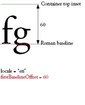
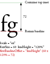
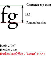
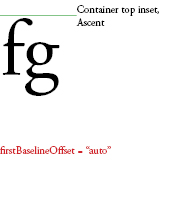
firstBaselineOffset | Type: Object CSS Inheritance: yes Specifies the baseline position of the first line in the container. Which baseline this property refers to depends on the container-level locale. For Japanese and Chinese, it is TextBaseline.IDEOGRAPHIC_BOTTOM; for all others it is TextBaseline.ROMAN.
The offset from the top inset (or right inset if blockProgression is RL) of the container to the baseline of the first line can be either BaselineOffset.ASCENT, meaning equal to the ascent of the line, BaselineOffset.LINE_HEIGHT, meaning equal to the height of that first line, or any fixed-value number to specify an absolute distance. BaselineOffset.AUTO aligns the ascent of the line with the container top inset.
Legal values as a string are flashx.textLayout.formats.BaselineOffset.AUTO, flashx.textLayout.formats.BaselineOffset.ASCENT, flashx.textLayout.formats.BaselineOffset.LINE_HEIGHT, flashx.textLayout.formats.FormatValue.INHERIT and numbers from 0 to 1000. Default value is undefined indicating not set. If undefined during the cascade this property will inherit its value from an ancestor. If no ancestor has set this property, it will have a value of AUTO. | GroupBase | ||
focusedTextSelectionColor | Type: uint Format: Color CSS Inheritance: yes The color of text when the component is enabled and has focus. | GroupBase | ||
 | Type: Class CSS Inheritance: no Skin used to draw the focus rectangle. | UIComponent | ||
fontFamily | Type: String CSS Inheritance: yes The name of the font to use, or a comma-separated list of font names. The Flash runtime renders the element with the first available font in the list. For example Arial, Helvetica, _sans causes the player to search for Arial, then Helvetica if Arial is not found, then _sans if neither is found. Default value is undefined indicating not set. If undefined during the cascade this property will inherit its value from an ancestor. If no ancestor has set this property, it will have a value of Arial. | GroupBase | ||
fontLookup | Type: String CSS Inheritance: yes Font lookup to use. Specifying FontLookup.DEVICE uses the fonts installed on the system that is running the SWF file. Device fonts result in a smaller movie size, but text is not always rendered the same across different systems and platforms. Specifying FontLookup.EMBEDDED_CFF uses font outlines embedded in the published SWF file. Embedded fonts increase the size of the SWF file (sometimes dramatically), but text is consistently displayed in the chosen font.
Legal values are flash.text.engine.FontLookup.DEVICE, flash.text.engine.FontLookup.EMBEDDED_CFF, flashx.textLayout.formats.FormatValue.INHERIT. Default value is undefined indicating not set. If undefined during the cascade this property will inherit its value from an ancestor. If no ancestor has set this property, it will have a value of DEVICE. | GroupBase | ||
fontSize | Type: Number Format: Length CSS Inheritance: yes The size of the text in pixels. Legal values are numbers from 1 to 720 and flashx.textLayout.formats.FormatValue.INHERIT. Default value is undefined indicating not set. If undefined during the cascade this property will inherit its value from an ancestor. If no ancestor has set this property, it will have a value of 12. | GroupBase | ||
fontStyle | Type: String CSS Inheritance: yes Style of text. May be FontPosture.NORMAL, for use in plain text, or FontPosture.ITALIC for italic. This property applies only to device fonts (fontLookup property is set to flash.text.engine.FontLookup.DEVICE).
Legal values are flash.text.engine.FontPosture.NORMAL, flash.text.engine.FontPosture.ITALIC, flashx.textLayout.formats.FormatValue.INHERIT. Default value is undefined indicating not set. If undefined during the cascade this property will inherit its value from an ancestor. If no ancestor has set this property, it will have a value of NORMAL. | GroupBase | ||
fontWeight | Type: String CSS Inheritance: yes Weight of text. May be FontWeight.NORMAL for use in plain text, or FontWeight.BOLD. Applies only to device fonts (fontLookup property is set to flash.text.engine.FontLookup.DEVICE).
Legal values are flash.text.engine.FontWeight.NORMAL, flash.text.engine.FontWeight.BOLD, flashx.textLayout.formats.FormatValue.INHERIT. Default value is undefined indicating not set. If undefined during the cascade this property will inherit its value from an ancestor. If no ancestor has set this property, it will have a value of NORMAL. | GroupBase | ||
 | Type: String CSS Inheritance: no The horizontal distance in pixels from the center of the component's content area to the center of the component. | UIComponent | ||
inactiveTextSelectionColor | Type: uint Format: Color CSS Inheritance: yes The color of text when the component is disabled. | GroupBase | ||
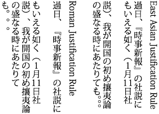
justificationRule | Type: String CSS Inheritance: yes Rule used to justify text in a paragraph. Default value is FormatValue.AUTO, which justifies text based on the paragraph's locale property. For all languages except Japanese and Chinese, FormatValue.AUTO becomes JustificationRule.SPACE, which adds extra space to the space characters. For Japanese and Chinese, FormatValue.AUTO becomes JustficationRule.EAST_ASIAN. In part, justification changes the spacing of punctuation. In Roman text the comma and Japanese periods take a full character's width but in East Asian text only half of a character's width. Also, in the East Asian text the spacing between sequential punctuation marks becomes tighter, obeying traditional East Asian typographic conventions. Note, too, in the example below the leading that is applied to the second line of the paragraphs. In the East Asian version, the last two lines push left. In the Roman version, the second and following lines push left.
Legal values are flashx.textLayout.formats.JustificationRule.EAST_ASIAN, flashx.textLayout.formats.JustificationRule.SPACE, flashx.textLayout.formats.FormatValue.AUTO, flashx.textLayout.formats.FormatValue.INHERIT. Default value is undefined indicating not set. If undefined during the cascade this property will inherit its value from an ancestor. If no ancestor has set this property, it will have a value of flashx.textLayout.formats.FormatValue.AUTO. | GroupBase | ||
justificationStyle | Type: String CSS Inheritance: yes The style used for justification of the paragraph. Used only in conjunction with a justificationRule setting of JustificationRule.EAST_ASIAN.
Default value of FormatValue.AUTO is resolved to JustificationStyle.PUSH_IN_KINSOKU for all locales. The constants defined by the JustificationStyle class specify options for handling kinsoku characters, which are Japanese characters that cannot appear at either the beginning or end of a line. If you want looser text, specify JustificationStyle.PUSH-OUT-ONLY. If you want behavior that is like what you get with the justificationRule of JustificationRule.SPACE, use JustificationStyle.PRIORITIZE-LEAST-ADJUSTMENT.
Legal values are flash.text.engine.JustificationStyle.PRIORITIZE_LEAST_ADJUSTMENT, flash.text.engine.JustificationStyle.PUSH_IN_KINSOKU, flash.text.engine.JustificationStyle.PUSH_OUT_ONLY, flashx.textLayout.formats.FormatValue.AUTO, flashx.textLayout.formats.FormatValue.INHERIT. Default value is undefined indicating not set. If undefined during the cascade this property will inherit its value from an ancestor. If no ancestor has set this property, it will have a value of flashx.textLayout.formats.FormatValue.AUTO. | GroupBase | ||
kerning | Type: String CSS Inheritance: yes | GroupBase | ||
 | Type: String CSS Inheritance: yes Specifies the desired layout direction of a component. | UIComponent | ||
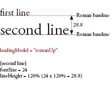
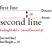
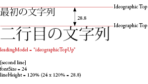
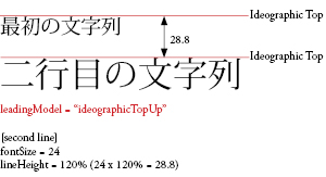
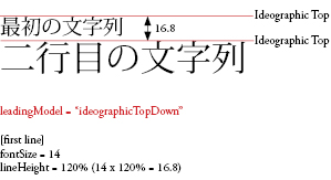
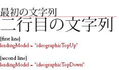
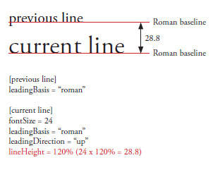
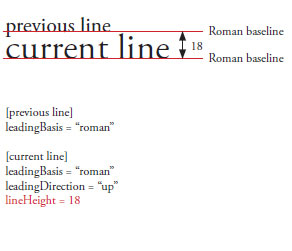
leadingModel | Type: String CSS Inheritance: yes Specifies the leading model, which is a combination of leading basis and leading direction. Leading basis is the baseline to which the lineHeight property refers. Leading direction determines whether the lineHeight property refers to the distance of a line's baseline from that of the line before it or the line after it. The default value of FormatValue.AUTO is resolved based on the paragraph's locale property. For Japanese and Chinese, it is LeadingModel.IDEOGRAPHIC_TOP_DOWN and for all others it is LeadingModel.ROMAN_UP.Leading Basis:
Leading Direction:
Legal values are flashx.textLayout.formats.LeadingModel.ROMAN_UP, flashx.textLayout.formats.LeadingModel.IDEOGRAPHIC_TOP_UP, flashx.textLayout.formats.LeadingModel.IDEOGRAPHIC_CENTER_UP, flashx.textLayout.formats.LeadingModel.IDEOGRAPHIC_TOP_DOWN, flashx.textLayout.formats.LeadingModel.IDEOGRAPHIC_CENTER_DOWN, flashx.textLayout.formats.LeadingModel.APPROXIMATE_TEXT_FIELD, flashx.textLayout.formats.LeadingModel.ASCENT_DESCENT_UP, flashx.textLayout.formats.LeadingModel.AUTO, flashx.textLayout.formats.FormatValue.INHERIT. Default value is undefined indicating not set. If undefined during the cascade this property will inherit its value from an ancestor. If no ancestor has set this property, it will have a value of AUTO. | GroupBase | ||
 | Type: String CSS Inheritance: no The horizontal distance, in pixels, from the left edge of the component to the left edge of its parent container's content area. | UIComponent | ||
ligatureLevel | Type: String CSS Inheritance: yes Controls which of the ligatures that are defined in the font may be used in the text. The ligatures that appear for each of these settings is dependent on the font. A ligature occurs where two or more letter-forms are joined as a single glyph. Ligatures usually replace consecutive characters sharing common components, such as the letter pairs 'fi', 'fl', or 'ae'. They are used with both Latin and Non-Latin character sets. The ligatures enabled by the values of the LigatureLevel class - MINIMUM, COMMON, UNCOMMON, and EXOTIC - are additive. Each value enables a new set of ligatures, but also includes those of the previous types.Note: When working with Arabic or Syriac fonts,
Legal values are flash.text.engine.LigatureLevel.MINIMUM, flash.text.engine.LigatureLevel.COMMON, flash.text.engine.LigatureLevel.UNCOMMON, flash.text.engine.LigatureLevel.EXOTIC, flashx.textLayout.formats.FormatValue.INHERIT. Default value is undefined indicating not set. If undefined during the cascade this property will inherit its value from an ancestor. If no ancestor has set this property, it will have a value of COMMON. | GroupBase | ||
lineHeight | Type: Object CSS Inheritance: yes Leading controls for the text. The distance from the baseline of the previous or the next line (based on LeadingModel) to the baseline of the current line is equal to the maximum amount of the leading applied to any character in the line. This is either a number or a percent. If specifying a percent, enter a string value, like 140%.
Legal values as a number are from -720 to 720. Legal values as a percent are numbers from -1000% to 1000%. Legal values include flashx.textLayout.formats.FormatValue.INHERIT. Default value is undefined indicating not set. If undefined during the cascade this property will inherit its value from an ancestor. If no ancestor has set this property, it will have a value of 120%. | GroupBase | ||
lineThrough | Type: Boolean CSS Inheritance: yes If true, applies strikethrough, a line drawn through the middle of the text.
Legal values are true, false and flashx.textLayout.formats.FormatValue.INHERIT. Default value is undefined indicating not set. If undefined during the cascade this property will inherit its value from an ancestor. If no ancestor has set this property, it will have a value of false. | GroupBase | ||
locale | Type: String CSS Inheritance: yes The locale of the text. Controls case transformations and shaping. Standard locale identifiers as described in Unicode Technical Standard #35 are used. For example en, en_US and en-US are all English, ja is Japanese. Default value is undefined indicating not set. If undefined during the cascade this property will inherit its value from an ancestor. If no ancestor has set this property, it will have a value of en. | GroupBase | ||
paragraphEndIndent | Type: Number Format: length CSS Inheritance: yes A Number that specifies, in pixels, the amount to indent the paragraph's end edge. Refers to the right edge in left-to-right text and the left edge in right-to-left text. Legal values are numbers from 0 to 1000 and flashx.textLayout.formats.FormatValue.INHERIT. Default value is undefined indicating not set. If undefined during the cascade this property will inherit its value from an ancestor. If no ancestor has set this property, it will have a value of 0. | GroupBase | ||
paragraphSpaceAfter | Type: Number Format: length CSS Inheritance: yes A Number that specifies the amount of space, in pixels, to leave after the paragraph. Collapses in tandem with paragraphSpaceBefore.
Legal values are numbers from 0 to 1000 and flashx.textLayout.formats.FormatValue.INHERIT. Default value is undefined indicating not set. If undefined during the cascade this property will inherit its value from an ancestor. If no ancestor has set this property, it will have a value of 0. | GroupBase | ||
paragraphSpaceBefore | Type: Number Format: length CSS Inheritance: yes A Number that specifies the amount of space, in pixels, to leave before the paragraph. Collapses in tandem with paragraphSpaceAfter.
Legal values are numbers from 0 to 1000 and flashx.textLayout.formats.FormatValue.INHERIT. Default value is undefined indicating not set. If undefined during the cascade this property will inherit its value from an ancestor. If no ancestor has set this property, it will have a value of 0. | GroupBase | ||
paragraphStartIndent | Type: Number Format: length CSS Inheritance: yes A Number that specifies, in pixels, the amount to indent the paragraph's start edge. Refers to the left edge in left-to-right text and the right edge in right-to-left text. Legal values are numbers from 0 to 1000 and flashx.textLayout.formats.FormatValue.INHERIT. Default value is undefined indicating not set. If undefined during the cascade this property will inherit its value from an ancestor. If no ancestor has set this property, it will have a value of 0. | GroupBase | ||
renderingMode | Type: String CSS Inheritance: yes The rendering mode used for this text. Applies only to embedded fonts ( fontLookup property is set to FontLookup.EMBEDDED_CFF).
Legal values are flash.text.engine.RenderingMode.NORMAL, flash.text.engine.RenderingMode.CFF, flashx.textLayout.formats.FormatValue.INHERIT. Default value is undefined indicating not set. If undefined during the cascade this property will inherit its value from an ancestor. If no ancestor has set this property, it will have a value of CFF. | GroupBase | ||
 | Type: String CSS Inheritance: no The horizontal distance, in pixels, from the right edge of the component to the right edge of its parent container's content area. | UIComponent | ||
tabStops | Type: String CSS Inheritance: yes Specifies the tab stops associated with the paragraph. Setters can take an array of flashx.textLayout.formats.TabStopFormat, a condensed string representation, undefined, or FormatValue.INHERIT. The condensed string representation is always converted into an array of flashx.textLayout.formats.TabStopFormat. The string-based format is a list of tab stops, where each tab stop is delimited by one or more spaces. A tab stop takes the following form: <alignment type><alignment position>|<alignment token>. The alignment type is a single character, and can be S, E, C, or D (or lower-case equivalents). S or s for start, E or e for end, C or c for center, D or d for decimal. The alignment type is optional, and if its not specified will default to S. The alignment position is a Number, and is specified according to FXG spec for Numbers (decimal or scientific notation). The alignment position is required. The vertical bar is used to separate the alignment position from the alignment token, and should only be present if the alignment token is present. The alignment token is optional if the alignment type is D, and should not be present if the alignment type is anything other than D. The alignment token may be any sequence of characters terminated by the space that ends the tab stop (for the last tab stop, the terminating space is optional; end of alignment token is implied). A space may be part of the alignment token if it is escaped with a backslash (\ ). A backslash may be part of the alignment token if it is escaped with another backslash (\\). If the alignment type is D, and the alignment token is not specified, it will take on the default value of null. If no tab stops are specified, a tab action defaults to the end of the line. Default value is undefined indicating not set. If undefined during the cascade this property will inherit its value from an ancestor. If no ancestor has set this property, it will have a value of null. | GroupBase | ||
textAlign | Type: String CSS Inheritance: yes Alignment of lines in the paragraph relative to the container. TextAlign.LEFT aligns lines along the left edge of the container. TextAlign.RIGHT aligns on the right edge. TextAlign.CENTER positions the line equidistant from the left and right edges. TextAlign.JUSTIFY spreads the lines out so they fill the space. TextAlign.START is equivalent to setting left in left-to-right text, or right in right-to-left text. TextAlign.END is equivalent to setting right in left-to-right text, or left in right-to-left text.
Legal values are flashx.textLayout.formats.TextAlign.LEFT, flashx.textLayout.formats.TextAlign.RIGHT, flashx.textLayout.formats.TextAlign.CENTER, flashx.textLayout.formats.TextAlign.JUSTIFY, flashx.textLayout.formats.TextAlign.START, flashx.textLayout.formats.TextAlign.END, flashx.textLayout.formats.FormatValue.INHERIT. Default value is undefined indicating not set. If undefined during the cascade this property will inherit its value from an ancestor. If no ancestor has set this property, it will have a value of START. | GroupBase | ||
textAlignLast | Type: String CSS Inheritance: yes Alignment of the last (or only) line in the paragraph relative to the container in justified text. If textAlign is set to TextAlign.JUSTIFY, textAlignLast specifies how the last line (or only line, if this is a one line block) is aligned. Values are similar to textAlign.
Legal values are flashx.textLayout.formats.TextAlign.LEFT, flashx.textLayout.formats.TextAlign.RIGHT, flashx.textLayout.formats.TextAlign.CENTER, flashx.textLayout.formats.TextAlign.JUSTIFY, flashx.textLayout.formats.TextAlign.START, flashx.textLayout.formats.TextAlign.END, flashx.textLayout.formats.FormatValue.INHERIT. Default value is undefined indicating not set. If undefined during the cascade this property will inherit its value from an ancestor. If no ancestor has set this property, it will have a value of START. | GroupBase | ||
textAlpha | Type: Number CSS Inheritance: yes Alpha (transparency) value for the text. A value of 0 is fully transparent, and a value of 1 is fully opaque. Display objects with textAlpha set to 0 are active, even though they are invisible.
Legal values are numbers from 0 to 1 and flashx.textLayout.formats.FormatValue.INHERIT. Default value is undefined indicating not set. If undefined during the cascade this property will inherit its value from an ancestor. If no ancestor has set this property, it will have a value of 1. | GroupBase | ||
textDecoration | Type: String CSS Inheritance: yes Decoration on text. Use to apply underlining; default is none. Legal values are flashx.textLayout.formats.TextDecoration.NONE, flashx.textLayout.formats.TextDecoration.UNDERLINE, flashx.textLayout.formats.FormatValue.INHERIT. Default value is undefined indicating not set. If undefined during the cascade this property will inherit its value from an ancestor. If no ancestor has set this property, it will have a value of NONE. | GroupBase | ||
textIndent | Type: Number Format: Length CSS Inheritance: yes A Number that specifies, in pixels, the amount to indent the first line of the paragraph. A negative indent will push the line into the margin, and possibly out of the container. Legal values are numbers from -1000 to 1000 and flashx.textLayout.formats.FormatValue.INHERIT. Default value is undefined indicating not set. If undefined during the cascade this property will inherit its value from an ancestor. If no ancestor has set this property, it will have a value of 0. | GroupBase | ||
textJustify | Type: String CSS Inheritance: yes Specifies options for justifying text. Default value is TextJustify.INTER_WORD, meaning that extra space is added to the space characters. TextJustify.DISTRIBUTE adds extra space to space characters and between individual letters. Used only in conjunction with a justificationRule value of JustificationRule.SPACE.
Legal values are flashx.textLayout.formats.TextJustify.INTER_WORD, flashx.textLayout.formats.TextJustify.DISTRIBUTE, flashx.textLayout.formats.FormatValue.INHERIT. Default value is undefined indicating not set. If undefined during the cascade this property will inherit its value from an ancestor. If no ancestor has set this property, it will have a value of INTER_WORD. | GroupBase | ||
textRotation | Type: String CSS Inheritance: yes Determines the number of degrees to rotate this text. Legal values are flash.text.engine.TextRotation.ROTATE_0, flash.text.engine.TextRotation.ROTATE_180, flash.text.engine.TextRotation.ROTATE_270, flash.text.engine.TextRotation.ROTATE_90, flash.text.engine.TextRotation.AUTO, flashx.textLayout.formats.FormatValue.INHERIT. Default value is undefined indicating not set. If undefined during the cascade this property will inherit its value from an ancestor. If no ancestor has set this property, it will have a value of AUTO. | GroupBase | ||
 | Type: String CSS Inheritance: no The vertical distance, in pixels, from the top edge of the component to the top edge of its parent container's content area. | UIComponent | ||
trackingLeft | Type: Object CSS Inheritance: yes Number in pixels (or percent of fontSize, like 120%) indicating the amount of tracking (manual kerning) to be applied to the left of each character. If kerning is enabled, the trackingLeft value is added to the values in the kerning table for the font. If kerning is disabled, the trackingLeft value is used as a manual kerning value. Supports both positive and negative values.
Legal values as a number are from -1000 to 1000. Legal values as a percent are numbers from -1000% to 1000%. Legal values include flashx.textLayout.formats.FormatValue.INHERIT. Default value is undefined indicating not set. If undefined during the cascade this property will inherit its value from an ancestor. If no ancestor has set this property, it will have a value of 0. | GroupBase | ||
trackingRight | Type: Object CSS Inheritance: yes Number in pixels (or percent of fontSize, like 120%) indicating the amount of tracking (manual kerning) to be applied to the right of each character. If kerning is enabled, the trackingRight value is added to the values in the kerning table for the font. If kerning is disabled, the trackingRight value is used as a manual kerning value. Supports both positive and negative values.
Legal values as a number are from -1000 to 1000. Legal values as a percent are numbers from -1000% to 1000%. Legal values include flashx.textLayout.formats.FormatValue.INHERIT. Default value is undefined indicating not set. If undefined during the cascade this property will inherit its value from an ancestor. If no ancestor has set this property, it will have a value of 0. | GroupBase | ||
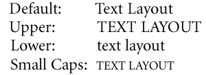
typographicCase | Type: String CSS Inheritance: yes The type of typographic case used for this text. Here are some examples:
Legal values are flashx.textLayout.formats.TLFTypographicCase.DEFAULT, flashx.textLayout.formats.TLFTypographicCase.CAPS_TO_SMALL_CAPS, flashx.textLayout.formats.TLFTypographicCase.UPPERCASE, flashx.textLayout.formats.TLFTypographicCase.LOWERCASE, flashx.textLayout.formats.TLFTypographicCase.LOWERCASE_TO_SMALL_CAPS, flashx.textLayout.formats.FormatValue.INHERIT. Default value is undefined indicating not set. If undefined during the cascade this property will inherit its value from an ancestor. If no ancestor has set this property, it will have a value of DEFAULT. | GroupBase | ||
unfocusedTextSelectionColor | Type: uint Format: Color CSS Inheritance: yes The color of text when the component is enabled but does not have focus. | GroupBase | ||
 | Type: String CSS Inheritance: no The vertical distance in pixels from the center of the component's content area to the center of the component. | UIComponent | ||
whiteSpaceCollapse | Type: String CSS Inheritance: yes Collapses or preserves whitespace when importing text into a TextFlow. WhiteSpaceCollapse.PRESERVE retains all whitespace characters. WhiteSpaceCollapse.COLLAPSE removes newlines, tabs, and leading or trailing spaces within a block of imported text. Line break tags () and Unicode line separator characters are retained.
Legal values are flashx.textLayout.formats.WhiteSpaceCollapse.PRESERVE, flashx.textLayout.formats.WhiteSpaceCollapse.COLLAPSE, flashx.textLayout.formats.FormatValue.INHERIT. Default value is undefined indicating not set. If undefined during the cascade this property will inherit its value from an ancestor. If no ancestor has set this property, it will have a value of COLLAPSE. | GroupBase | ||
| Style | Description | Defined By | ||
|---|---|---|---|---|
accentColor | Type: uint Format: Color CSS Inheritance: yes Theme: spark Accent color used by component skins. The default button skin uses this color to tint the background. Slider track highlighting uses this color. The default value is #0099FF. | GroupBase | ||
alternatingItemColors | Type: Array Format: Color CSS Inheritance: yes Theme: spark The colors to use for the backgrounds of the items in the list. The value is an array of two or more colors. The backgrounds of the list items alternate among the colors in the array. The default value is undefined. | GroupBase | ||
chromeColor | Type: uint Format: Color CSS Inheritance: yes Theme: spark The main color for a component. The default value is 0xCCCCCC. | GroupBase | ||
contentBackgroundAlpha | Type: Number CSS Inheritance: yes Theme: spark The alpha of the content background for this component. The default value is 1.0. | GroupBase | ||
contentBackgroundColor | Type: uint Format: Color CSS Inheritance: yes Theme: spark Color of the fill of an item renderer. The default value is 0xFFFFFF. | GroupBase | ||
disabledAlpha | Type: Number CSS Inheritance: no Theme: spark The alpha value when the container is disabled. The default value is 0.5. | GroupBase | ||
focusColor | Type: uint Format: Color CSS Inheritance: yes Theme: spark Color of focus ring when the component is in focus. The default value is 0x70B2EE. | GroupBase | ||
rollOverColor | Type: uint Format: Color CSS Inheritance: yes Theme: spark Color of the highlights when the mouse is over the component. The default value is 0xCEDBEF. | GroupBase | ||
symbolColor | Type: uint Format: Color CSS Inheritance: yes Theme: spark Color of any symbol of a component. Examples include the check mark of a CheckBox or the arrow of a scroll button. The default value is 0x000000. | GroupBase | ||
autoLayout | property |
autoLayout:Boolean| Language Version: | ActionScript 3.0 |
| Product Version: | Flex 4 |
| Runtime Versions: | Flash Player 10, AIR 1.5 |
If true, measurement and layout are done
when the position or size of a child is changed.
If false, measurement and layout are done only once,
when children are added to or removed from the container.
The default value is true.
Implementation
public function get autoLayout():Boolean public function set autoLayout(value:Boolean):voidbaselinePosition | property |
baselinePosition:Number [read-only] [override] | Language Version: | ActionScript 3.0 |
| Product Version: | Flex 3 |
| Runtime Versions: | Flash Player 9, AIR 1.1 |
The y-coordinate of the baseline of the first line of text of the component.
This property is used to implement
the baseline constraint style.
It is also used to align the label of a FormItem
with the controls in the FormItem.
Each component should override this property.
Implementation
override public function get baselinePosition():NumberclipAndEnableScrolling | property |
clipAndEnableScrolling:Boolean| Language Version: | ActionScript 3.0 |
| Product Version: | Flex 4 |
| Runtime Versions: | Flash Player 10, AIR 1.5 |
If true, specifies to clip the children to the boundaries of the viewport.
If false, the container children extend past the container boundaries,
regardless of the size specification of the component.
The default value is false.
Implementation
public function get clipAndEnableScrolling():Boolean public function set clipAndEnableScrolling(value:Boolean):voidcontentHeight | property |
contentHeight:Number [read-only] | Language Version: | ActionScript 3.0 |
| Product Version: | Flex 4 |
| Runtime Versions: | Flash Player 10, AIR 1.5 |
The height of the viewport's content.
If clipAndEnabledScrolling is true, the viewport's
contentHeight defines the limit for vertical scrolling
and the viewport's actual height defines how much of the content is visible.
To scroll through the content vertically, vary the
verticalScrollPosition between 0 and
contentHeight - height.
Implementations of this property must be Bindable and
must generate events of type propertyChange.
This property can be used as the source for data binding. When this property is modified, it dispatches the propertyChange event.
Implementation
public function get contentHeight():NumbercontentWidth | property |
contentWidth:Number [read-only] | Language Version: | ActionScript 3.0 |
| Product Version: | Flex 4 |
| Runtime Versions: | Flash Player 10, AIR 1.5 |
The width of the viewport's contents.
If clipAndEnabledScrolling is true, the viewport's
contentWidth defines the limit for horizontal scrolling
and the viewport's actual width defines how much of the content is visible.
To scroll through the content horizontally, vary the
horizontalScrollPosition between 0 and
contentWidth - width.
Implementations of this property must be Bindable and
must generate events of type propertyChange.
This property can be used as the source for data binding. When this property is modified, it dispatches the propertyChange event.
Implementation
public function get contentWidth():NumberhorizontalScrollPosition | property |
horizontalScrollPosition:Number| Language Version: | ActionScript 3.0 |
| Product Version: | Flex 4 |
| Runtime Versions: | Flash Player 10, AIR 1.5 |
The x coordinate of the origin of the viewport in the component's coordinate system,
where the default value is (0,0) corresponding to the upper-left corner of the component.
If clipAndEnableScrolling is true, setting this property
typically causes the viewport to be set to:
new Rectangle(horizontalScrollPosition, verticalScrollPosition, width, height)
Implementations of this property must be Bindable and
must generate events of type propertyChange.
This property can be used as the source for data binding. When this property is modified, it dispatches the propertyChange event.
Implementation
public function get horizontalScrollPosition():Number public function set horizontalScrollPosition(value:Number):voidlayout | property |
layout:LayoutBase| Language Version: | ActionScript 3.0 |
| Product Version: | Flex 4 |
| Runtime Versions: | Flash Player 10, AIR 1.5 |
The layout object for this container. This object is responsible for the measurement and layout of the visual elements in the container.
The default value is spark.layouts.BasicLayout.
Implementation
public function get layout():LayoutBase public function set layout(value:LayoutBase):voidSee also
luminosityClip | property |
luminosityClip:Boolean| Language Version: | ActionScript 3.0 |
| Product Version: | Flex 4 |
| Runtime Versions: | Flash Player 10, AIR 1.5 |
A property that controls whether the luminosity mask clips the masked content. This property can only have an effect if the graphic element has a mask applied to it that is of type MaskType.LUMINOSITY.
The default value is false.
Implementation
public function get luminosityClip():Boolean public function set luminosityClip(value:Boolean):voidSee also
luminosityInvert | property |
luminosityInvert:Boolean| Language Version: | ActionScript 3.0 |
| Product Version: | Flex 4 |
| Runtime Versions: | Flash Player 10, AIR 1.5 |
A property that controls the calculation of the RGB color value of a graphic element being masked by a luminosity mask. If true, the RGB color value of a pixel in the source content is inverted and multipled by the corresponding region in the mask. If false, the source content's pixel's RGB color value is used directly.
The default value is false.
Implementation
public function get luminosityInvert():Boolean public function set luminosityInvert(value:Boolean):voidmask | property |
mask:DisplayObject[override] | Language Version: | ActionScript 3.0 |
| Product Version: | Flex 4 |
| Runtime Versions: | Flash Player 10, AIR 1.5 |
Sets the mask. The mask will be added to the display list. The mask must not already on a display list nor in the elements array.
Implementation
override public function get mask():DisplayObject override public function set mask(value:DisplayObject):voidSee also
maskType | property |
maskType:String| Language Version: | ActionScript 3.0 |
| Product Version: | Flex 4 |
| Runtime Versions: | Flash Player 10, AIR 1.5 |
The mask type. Possible values are MaskType.CLIP, MaskType.ALPHA
or MaskType.LUMINOSITY.
Clip Masking
When masking in clip mode, a clipping masks is reduced to 1-bit. This means that a mask will not affect the opacity of a pixel in the source content; it either leaves the value unmodified, if the corresponding pixel in the mask is has a non-zero alpha value, or makes it fully transparent, if the mask pixel value has an alpha value of zero.
Alpha Masking
In alpha mode, the opacity of each pixel in the source content is multiplied by the opacity of the corresponding region of the mask. i.e., a pixel in the source content with an opacity of 1 that is masked by a region of opacity of .5 will have a resulting opacity of .5. A source pixel with an opacity of .8 masked by a region with opacity of .5 will have a resulting opacity of .4.
Luminosity Masking
A luminosity mask, sometimes called a 'soft mask', works very similarly to an alpha mask except that both the opacity and RGB color value of a pixel in the source content is multiplied by the opacity and RGB color value of the corresponding region in the mask.
Luminosity masking is not native to Flash but is common in Adobe Creative Suite tools like Adobe Illustrator and Adobe Photoshop. In order to accomplish the visual effect of a luminosity mask in Flash-rendered content, a graphic element specifying a luminosity mask actually instantiates a shader filter that mimics the visual look of a luminosity mask as rendered in Adobe Creative Suite tools.
Objects being masked by luminosity masks can set properties to control the RGB color value and clipping of the mask. See the luminosityInvert and luminosityClip attributes.
The default value is MaskType.CLIP.
This property can be used as the source for data binding. When this property is modified, it dispatches the propertyChange event.
Implementation
public function get maskType():String public function set maskType(value:String):voidSee also
mouseEnabledWhereTransparent | property |
mouseEnabledWhereTransparent:Boolean| Language Version: | ActionScript 4.0 |
| Product Version: | Flex 4 |
| Runtime Versions: | Flash Player 10, AIR 1.5 |
When true, this property
ensures that the entire bounds of the Group respond to
mouse events such as click and roll over.
The default value is true.
Implementation
public function get mouseEnabledWhereTransparent():Boolean public function set mouseEnabledWhereTransparent(value:Boolean):voidnumElements | property |
numElements:int [read-only] | Language Version: | ActionScript 3.0 |
| Product Version: | Flex 4 |
| Runtime Versions: | Flash Player 10, AIR 1.5 |
The number of visual elements in this container. Visual elements include classes that implement the IVisualElement interface, such as subclasses of UIComponent and GraphicElement.
Implementation
public function get numElements():intoverlay | property |
overlay:DisplayLayer [read-only] | Language Version: | ActionScript 3.0 |
| Product Version: | Flex 4 |
| Runtime Versions: | Flash Player 10, AIR 1.5 |
The overlay plane for this group. All objects of the overlay plane render on top of the Group elements.
Note: Do not retain this object because the group destroys and creates it on demand.
Implementation
public function get overlay():DisplayLayerresizeMode | property |
resizeMode:String| Language Version: | ActionScript 3.0 |
| Product Version: | Flex 4 |
| Runtime Versions: | Flash Player 10, AIR 1.5 |
The ResizeMode for this container. If the resize mode
is set to ResizeMode.NO_SCALE, resizing is done by laying
out the children with the new width and height. If the
resize mode is set to ResizeMode.SCALE, all of the children
keep their unscaled width and height and the children
are scaled to change size.
The default value is ResizeMode.NO_SCALE, corresponding to "noScale".
Implementation
public function get resizeMode():String public function set resizeMode(value:String):voidSee also
verticalScrollPosition | property |
verticalScrollPosition:Number| Language Version: | ActionScript 3.0 |
| Product Version: | Flex 4 |
| Runtime Versions: | Flash Player 10, AIR 1.5 |
The y coordinate of the origin of the viewport in the component's coordinate system,
where the default value is (0,0) corresponding to the upper-left corner of the component.
If clipAndEnableScrolling is true, setting this property
typically causes the viewport to be set to:
new Rectangle(horizontalScrollPosition, verticalScrollPosition, width, height)
Implementations of this property must be Bindable and
must generate events of type propertyChange.
This property can be used as the source for data binding. When this property is modified, it dispatches the propertyChange event.
Implementation
public function get verticalScrollPosition():Number public function set verticalScrollPosition(value:Number):voidGroupBase | () | Constructor |
public function GroupBase()| Language Version: | ActionScript 3.0 |
| Product Version: | Flex 4 |
| Runtime Versions: | Flash Player 10, AIR 1.5 |
Constructor.
createChildren | () | method |
override protected function createChildren():voidCreate child objects of the component. This is an advanced method that you might override when creating a subclass of UIComponent.
A component that creates other components or objects within it is called a composite component.
For example, the Flex ComboBox control is actually made up of a TextInput control
to define the text area of the ComboBox, and a Button control to define the ComboBox arrow.
Components implement the createChildren() method to create child
objects (such as other components) within the component.
From within an override of the createChildren() method,
you call the addChild() method to add each child object.
You do not call this method directly. Flex calls the
createChildren() method in response to the call to
the addChild() method to add the component to its parent.
getElementAt | () | method |
public function getElementAt(index:int):IVisualElement| Language Version: | ActionScript 3.0 |
| Product Version: | Flex 4 |
| Runtime Versions: | Flash Player 10, AIR 1.5 |
Returns the visual element at the specified index.
Parameters
index:int — The index of the element to retrieve.
|
IVisualElement — The element at the specified index.
|
getElementIndex | () | method |
public function getElementIndex(element:IVisualElement):int| Language Version: | ActionScript 3.0 |
| Product Version: | Flex 4 |
| Runtime Versions: | Flash Player 10, AIR 1.5 |
Returns the index position of a visual element.
Parameters
element:IVisualElement — The visual element.
|
int — The index position of the element in the container.
|
getHorizontalScrollPositionDelta | () | method |
public function getHorizontalScrollPositionDelta(navigationUnit:uint):Number| Language Version: | ActionScript 3.0 |
| Product Version: | Flex 4 |
| Runtime Versions: | Flash Player 10, AIR 1.5 |
Returns the change to the horizontal scroll position to handle
different scrolling options.
These options are defined by the NavigationUnit class: END, HOME,
LEFT, PAGE_LEFT, PAGE_RIGHT, and RIGHT.
Parameters
navigationUnit:uint — Takes the following values:
getElementBoundsLeftOfScrollRect() and
getElementBoundsRightOfScrollRect() to determine the bounds of
the elements. Layout classes usually override those methods instead of
getHorizontalScrollPositionDelta().
|
Number |
getVerticalScrollPositionDelta | () | method |
public function getVerticalScrollPositionDelta(navigationUnit:uint):Number| Language Version: | ActionScript 3.0 |
| Product Version: | Flex 4 |
| Runtime Versions: | Flash Player 10, AIR 1.5 |
Returns the change to the horizontal scroll position to handle
different scrolling options.
These options are defined by the NavigationUnit class:
DOWN, END, HOME,
PAGE_DOWN, PAGE_UP, and UP.
Parameters
navigationUnit:uint — Takes the following values:
PAGE_UPgetElementBoundsAboveScrollRect() and
getElementBoundsBelowScrollRect() to determine the bounds of
the elements. Layout classes usually override those methods instead of
getVerticalScrollPositionDelta().
|
Number |
getVirtualElementAt | () | method |
public function getVirtualElementAt(index:int, eltWidth:Number = NaN, eltHeight:Number = NaN):IVisualElement| Language Version: | ActionScript 3.0 |
| Product Version: | Flex 4 |
| Runtime Versions: | Flash Player 10, AIR 1.5 |
Layouts that honor the useVirtualLayout flag will use this
method at updateDisplayList() time to get layout elements that are "in view",
i.e. that overlap the Group's scrollRect.
If the element to be returned wasn't already a visible child, i.e. if it was created or recycled, and either eltWidth or eltHeight is specified, then the element's initial size is set with setLayoutBoundsSize() before it's validated. This is important for components, like text, that reflow when the layout is justified to the Group's width or height.
The returned layout element will have been validated.
This method will lazily create or "recycle" and validate layout elements as needed.
This method is not intended to be called directly, layouts that support virutalization will call it.
Parameters
index:int — The index of the element to retrieve.
| |
eltWidth:Number (default = NaN) | |
eltHeight:Number (default = NaN) |
IVisualElement — The validated element at the specified index.
|
setContentSize | () | method |
public function setContentSize(width:Number, height:Number):void| Language Version: | ActionScript 3.0 |
| Product Version: | Flex 4 |
| Runtime Versions: | Flash Player 10, AIR 1.5 |
Sets the contentWidth and contentHeight
properties.
This method is intended for layout class developers who should
call it from updateDisplayList() methods.
Parameters
width:Number — The new value of contentWidth.
| |
height:Number — The new value of contentHeight.
|
Thu May 20 2010, 02:19 AM -07:00

 Show MXML Syntax


